



Most data literacy training in social services fails for a pretty boring reason: it happens once, uses somebody else's spreadsheet, and never touches the numbers people actually work with. Someone from central office pulls up a slide about "understanding your data," everyone nods politely, and two weeks later a caseworker is still reading a 63% completion rate as "pretty good" without asking what it's a percentage of.
The fix isn't a workshop. It's a short, repeatable clinic you run monthly during time you already have — supervision blocks, team meetings, the tail end of a case conference. Forty-five minutes. Same three exercises every time, rotated across different local datasets. After a few months, people stop treating dashboards as decoration and start arguing with them, which is exactly what you want.
This is the agenda I'd hand a supervisor who has zero interest in becoming a data analyst and no time to build one from scratch. Three micro-exercises, the interpretation heuristics that go with each, talking points so you're not improvising, and a rubric you can score in about five minutes.
Why the usual approach doesn't stick
The gap isn't that caseworkers can't do math. It's that numbers arrive stripped of context, and nobody feels like they have permission to question them.
A typical example: a housing team's monthly report shows "average days to placement: 41." Sounds fine. But that average is hiding two clients who took 190 days each, dragging the mean up, while the median sits closer to 22. The team never sees the median because the report doesn't show it. So when a funder asks why placements are slow, everyone panics over a problem that lives in two outlier cases, not the whole caseload.
That's the real literacy gap — not calculation, but interpretation. Can your team look at a number and ask the second question? What's the denominator? Is this an average hiding a spread? Did the definition of "placement" change last quarter? Those instincts don't come from a slide deck. They come from repeatedly practicing on data people actually recognize.
There's also a trust problem underneath all of this. When people don't understand a metric, they either ignore it or fear it. A caseworker who's afraid of the outcome dashboard will quietly stop entering the fields that feed it, which corrupts the data further, which makes the dashboard even less trustworthy. It's a slow spiral, and it usually starts with one confusing report nobody ever explained.
The clinic structure
Three exercises, run in order, on real numbers pulled from your own case management system the day before. Don't clean the data first. Messy is the point — the mess is where the learning actually lives.
Eliminate case management chaos.
TryCasi helps you organize, monitor, and report on every case efficiently and securely.
- Centralized case tracking
- Automated client notifications
- Team task coordination
No credit card required
| Exercise | Time | What it builds | Data you bring |
|---|---|---|---|
| 1. Denominator hunt | 12 min | Reading rates and percentages critically | One recent rate/percentage report |
| 2. Average vs. reality | 15 min | Spotting when a mean lies | Any "average days/time to X" metric |
| 3. Definition drift check | 12 min | Catching changed or fuzzy field definitions | Two versions of the same monthly report |
| Debrief + rubric | 6 min | Anchoring the habit | — |
The whole thing fits in supervision. If you already run structured supervision rhythms — and if you don't, the supervision model that prevents burnout is a solid backbone to hang this on — the clinic drops right into the meeting you already hold.
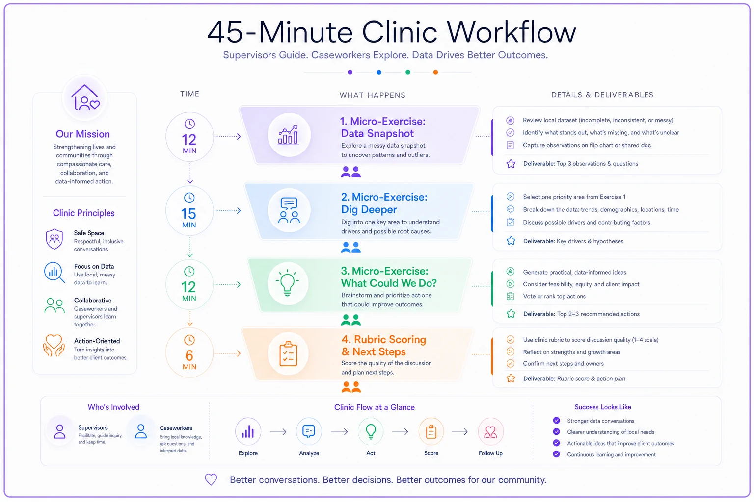
Here's a quick visual of the clinic flow.
Exercise 1: The denominator hunt
Put one percentage on the screen. Just one. Something like: "Follow-up completed: 71%."
Ask the team three questions out loud before anyone comments on whether 71% is good:
-
71% of what — how many cases is that actually?
-
Who got excluded from the denominator? (Closed cases? Transfers? No-contact clients?)
-
What counts as "completed" — a phone call, a visit, a logged note?
The interpretation heuristic: a percentage without its denominator is basically a rumor. If the denominator is 14 cases, one client swings the number by 7 points. That's not a trend, it's noise.
What usually surprises people: the first time you run this, someone discovers the "71%" excludes all the cases where the client couldn't be reached — which is precisely the group you'd most want to track. The metric was quietly measuring the easy cases. That realization does more for data literacy than an hour of theory ever would.
Supervisor talking points:
-
"Before we judge the number, let's find the denominator. Where does it live?"
-
"If one case can move this by more than a couple points, we treat it as a small sample and say so."
-
"Who's not in this count, and does that matter for what we're deciding?"
Put one percentage on the screen. Just one. Something like: "Follow-up completed: 71%."
Exercise 2: Average vs. reality
Take any "average time to X" your system produces — average days to first contact, average length of engagement, average time to close.
Have someone pull the underlying list of individual values. Then sketch the spread on paper or a whiteboard. You don't need software. Just call out the values and mark roughly where they cluster.
Almost every time, the average sits in a range where very few actual cases live. A real example: a team's "average time to first contact" came out at 5.8 days. When they listed the actual cases, most clients were contacted within 2 days — but a handful of hard-to-reach cases sat at 20-plus days and dragged the mean up significantly. The "average" described basically nobody on the caseload.
The interpretation heuristic: when you hear "average," ask for the median and the two extremes. If the mean and median are far apart, the story is in the outliers, not the middle.
Why this matters operationally: decisions get made on that 5.8. Someone sets a target of "under 5 days" and the whole team feels like they're failing, when most of them are hitting 2. The real work is on the 4 or 5 stuck cases — a completely different intervention than telling everyone to speed up.
Supervisor talking points:
-
"Is this a mean or a median? If nobody knows, that's our answer for today."
-
"Where are the outliers, and are they the same few cases every month?"
-
"Would fixing the average mean helping everyone, or just unsticking three cases?"
If you can't get the full underlying list, ask for the median and the top/bottom few cases to approximate the spread.
This exercise pairs naturally with how you think about outcome measurement more broadly. If your team is building out indicators, the practical framework for measuring social services outcomes covers the cadence side; this clinic gives your people the reading-it-critically side.
Exercise 3: Definition drift check
Bring two copies of the same monthly report — this month and a few months back. Put them side by side.
Ask: has the definition of anything changed? A field renamed? A category split into two? A "closed" status that now includes something it didn't before?
Definition drift is the silent killer of trend lines. A team celebrating that "re-engagement rate doubled" might just be counting a new intake category that got folded in mid-year. Nothing improved. The definition moved.
The interpretation heuristic: before you believe a change over time, confirm the thing being counted is still the same thing. A jump or drop of more than 30% month-over-month is more often a definition or data-entry change than a real shift in what's actually happening.
A pattern worth naming: drift usually enters through a system update or a well-meaning admin who "cleaned up" the dropdown options. Nobody tells the frontline. Suddenly the numbers move and everyone invents explanations for a change that's purely mechanical.
Supervisor talking points:
-
"Same field name — but is it still counting the same thing?"
-
"Did anything change in the system or our forms since the last report?"
-
"If a number jumped a lot, our first guess is a definition change, not a miracle."
Definition drift is the silent killer of trend lines. A team celebrating that "re-engagement rate doubled" might just be counting a new intake category that got folded in mid-year. Nothing improved. The definition moved.
The assessment rubric
Score the team, not individuals. You're measuring whether the group is building the reflex, and you can run this in the last few minutes of the session.
Rate each area 1–4:
-
1 — takes numbers at face value, no questions asked
-
2 — asks one clarifying question when prompted
-
3 — routinely asks about denominators, spread, and definitions without prompting
-
4 — catches a real interpretation error in live data and proposes what to check next
Areas to score:
-
Denominator awareness — does the team ask "of what?" automatically?
-
Average skepticism — do they distinguish mean from median and hunt for outliers?
-
Definition stability — do they check whether counts still mean the same thing?
-
Sample-size sense — do they flag when a number is too small to trust?
-
Action linkage — do they connect the number to a decision, not just describe it?
Track the total out of 20 month to month. Movement from, say, 8 to 14 over a quarter is a real, visible sign the clinic is working. You're not looking for perfection — you're looking for the slope to go up.
A quick real scenario
A mid-sized family services team — roughly 9 caseworkers, two supervisors — kept getting burned in funder reviews because their reported numbers didn't survive questions. Someone would ask "why did completion drop 18%?" and nobody in the room could explain it.
They started running this clinic in their existing biweekly team meeting. First month, the denominator hunt exposed that their "completion" metric silently excluded transferred cases — which had spiked that quarter because of a staffing change. The "drop" was an artifact.
Three months in, the team's rubric score went from around 7 to about 15. More concretely: at the next funder review, a caseworker fielded the "why did this move?" question in real time by pointing straight to the transferred-case exclusion. No panic, no scrambling for the analyst. The supervisor said the difference wasn't data quality — it was that people finally knew how to read their own reports out loud.
When this makes sense — and when it doesn't
Run this clinic if: your team already sees dashboards or monthly reports but treats them passively, or if numbers keep surprising you in funder meetings. It's built for teams that have data and don't trust it yet.
Skip it for now if: your data is so incomplete that there's nothing meaningful to interpret. If half your priority fields are blank, fix data entry first — no interpretation skill helps you read a mostly-empty table. Get the input reliable, then come back and teach people to read it.
Who this isn't for: if one person owns all reporting and the rest of the team never touches numbers, don't force everyone through it. Run a lighter version, or focus the clinic on the two or three people who actually make decisions off the data.
Where the software fits — quietly
The clinic runs on paper if it has to. But a couple things get easier when your case management platform can pull the underlying case list behind any metric, not just the summary number. The denominator hunt and the average-vs-reality exercise both depend on being able to click a percentage and see the actual cases behind it. If your system exposes that — the raw list, the field definitions, and enough version history to catch drift — the exercises take minutes instead of a manual export scramble.
That's really the only tooling requirement here. Everything else is habit. The platform's job isn't to be smart for you; it's to make the numbers inspectable so your team can practice being skeptical of them.
The habit is the point
Data literacy isn't a certificate. It's whether your team asks the second question before they believe a number. Run the same three exercises every month on fresh local data, score the reflex with the rubric, and watch the passivity fade. In a few months you'll have a room full of people who look at a clean-looking 71% and immediately ask "of what, and who got left out?" — which is the whole game.
Ready to transform your social services workflow?
Join 500+ agencies using TryCasi to improve case outcomes, enhance collaboration, and reduce administrative burden.