


Most social services teams end up in one of two camps when it comes to outcomes measurement. Either they're collecting mountains of data that nobody looks at, or they're scrambling to pull together reports at the last minute with whatever numbers they can find. Both approaches waste time and completely miss the point — understanding whether your interventions are actually working.
The real challenge isn't finding metrics to track. Funders, boards, and accreditation bodies will happily hand you lists of 50+ indicators they want measured. The challenge is building a sustainable system that captures meaningful data without turning your caseworkers into data entry clerks.
After setting up measurement frameworks for dozens of small social services organizations — from homeless outreach teams to youth mentoring programs to elder care coordinators — the same patterns keep showing up. Teams that succeed at social services outcomes measurement don't track everything. They pick 5-7 core indicators, automate collection where possible, and build validation checks that catch bad data before it corrupts their reports.
Why standard measurement frameworks break down in small teams
Small social services teams face a completely different reality than the large agencies these frameworks were designed for. You don't have dedicated data analysts. Your case managers are already stretched thin. And your clients' situations are often too complex to fit neatly into predefined outcome categories.
Take housing stability as an example. Large organizations might track days housed, housing quality scores, and neighborhood safety ratings. But when you're a three-person team serving 40 clients, you need something simpler. Maybe you track just two things: whether someone maintained housing for 90 days and whether they needed emergency shelter assistance. That's enough to show progress without overwhelming your capacity.
The temptation is to adopt whatever framework your biggest funder uses. But those frameworks assume resources you don't have — someone whose job is purely data collection and analysis, standardized service delivery models, clients who fit into neat categories.
What actually works is building a lightweight framework that pulls from established models but fits your operational reality. You take the concept of measuring housing stability but simplify it to match what your team can actually sustain.
Selecting indicators that balance funder requirements with operational capacity
Start by mapping what you're already required to report. Pull out every grant report, board presentation, and accreditation requirement from the past year. Create a simple spreadsheet listing each indicator, who requires it, and how often it's reported.
Eliminate case management chaos.
TryCasi helps you organize, monitor, and report on every case efficiently and securely.
- Centralized case tracking
- Automated client notifications
- Team task coordination
No credit card required
You'll probably find significant overlap. Three different funders might want employment data, just formatted differently. Your board might want the same client satisfaction metrics your accreditor requires. This overlap is your opportunity — these become your core indicators since you're collecting them anyway.
Use the overlap between funder requirements to define your 5-7 core indicators so you collect once and report many times.
Next, identify the gaps between what you're required to track and what actually helps you improve services. Required metrics tend to focus on outputs — number of clients served, services delivered, referrals made. But you need outcome indicators that show whether those services actually helped.
For a youth mentoring program, funders might require:
-
Number of mentoring sessions
-
Hours of service delivered
-
Number of youth enrolled
-
Demographic breakdowns
But to actually improve your program, you might add:
-
School attendance rates (collected monthly from school partners)
-
Self-reported confidence scores (simple 1-5 scale collected quarterly)
-
Program completion rates (calculated automatically from attendance data)
The trick is finding indicators that serve double duty. School attendance satisfies funders who want educational outcomes while also giving you actionable data about which youth might need extra support.
Setting data collection cadence without overwhelming frontline staff
Data collection frequency is where most measurement systems fall apart. Daily collection sounds great until week three when staff stops entering data because they're too busy actually serving clients. Annual collection is manageable but gives you data too late to be useful.
The sweet spot varies by indicator type:
Weekly collection works for:
-
Service delivery counts (automatically pulled from scheduling systems)
-
Attendance and participation (captured during regular check-ins)
-
Crisis interventions (logged immediately as part of safety protocols)
Monthly collection works for:
-
Progress indicators (housing status, employment, health metrics)
-
Partner-reported data (school attendance, medical appointments kept)
-
Relationship quality measures (brief scoring during case reviews)
Quarterly collection works for:
-
Client satisfaction surveys
-
Self-assessment scales
-
Detailed outcome evaluations
-
Staff capacity metrics
Build collection into existing workflows rather than creating new tasks. If case managers already do monthly check-ins, add a two-minute outcomes update to that conversation. If clients already sign in for services, add a simple mood or satisfaction rating to the sign-in sheet.
One homeless services team cut their data burden by roughly 60% by shifting from daily to weekly collection for most metrics. They kept daily tracking only for bed counts and safety incidents — things that genuinely needed real-time monitoring. Everything else moved to weekly or monthly cycles, collected during activities that were already happening.
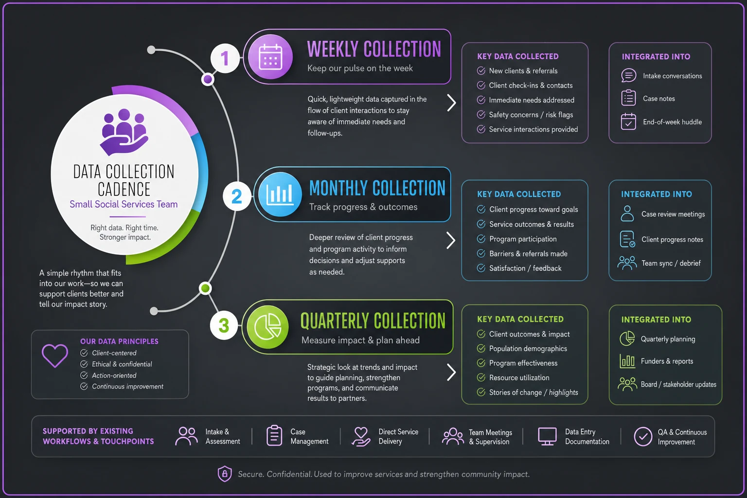
This diagram shows how weekly, monthly, and quarterly tasks fit into regular workflows and existing touchpoints so teams can visualize where data collection happens.
Creating validation checks that catch data problems before reports
Bad data is worse than no data. It undermines credibility, leads to poor decisions, and wastes time when you have to go back and fix things. But in small teams without dedicated data staff, quality control often gets skipped until someone notices your report shows 500% program completion rates.
Range checks: Set acceptable ranges for each indicator. If normal program attendance is 10-30 youth per session, flag anything outside 5-50 for review. This catches data entry errors and genuine anomalies that need investigation.
Consistency checks: Compare new data against historical patterns. If someone who's been stably housed for six months suddenly shows as homeless, trigger a verification. Either the data's wrong or something significant happened that needs attention.
Completion checks: Track which data points are missing and why. "Client declined to answer" is valid and important information. A blank field might mean the question wasn't asked at all. Build prompts that distinguish between missing data and actual zeros.
Cross-reference checks: When multiple indicators should align, verify they do. If someone reports full-time employment but zero income, something needs investigation. If program attendance is high but satisfaction scores are dropping, that's worth digging into.
A simple validation dashboard helps catch issues early. One team built a basic spreadsheet that turned red when data fell outside expected ranges, yellow for missing data, and green when everything looked normal. They reviewed it during weekly team meetings and caught most problems within days rather than discovering them during quarterly reports.
Building reports that funders want while keeping internal tracking useful
Funders want success stories and aggregate numbers. Your team needs actionable insights and individual client tracking. These aren't mutually exclusive, but they require different presentation layers on the same underlying data.
Start with your internal operational dashboard — the view your team uses daily or weekly to manage services:
Client-level view: Individual progress tracking, upcoming milestones, risk indicators, recent changes. This is what case managers need to do their jobs effectively.
Team-level view: Caseload distribution, service delivery patterns, aggregate outcomes by worker, capacity indicators. This helps supervisors allocate resources and spot support needs early.
Program-level view: Overall outcome trends, comparative performance across programs, cost per outcome, waitlist dynamics. This guides strategic decisions.
Then build external reports as formatted exports from this same system. The quarterly funder report pulls predetermined metrics with appropriate anonymization. The board presentation aggregates key indicators with trend lines. The annual report pairs success stories with outcome data.
Don't maintain separate systems for internal and external reporting. That's how discrepancies creep in and workload doubles. One data collection process, multiple report formats.
Templates and tools for immediate implementation
Rather than starting from scratch, adapt these field-tested templates to your specific needs:
Basic Outcome Tracking Spreadsheet
-
Client ID and basic demographics
-
5-7 core outcome indicators with collection dates
-
Validation flags for out-of-range or missing data
-
Simple formulas for completion rates and averages
-
Quarterly summary tabs that auto-populate from monthly data
Data Collection Schedule
-
Calendar view showing which metrics get collected when
-
Staff assignments for each collection task
-
Embedded reminders for quarterly surveys or annual assessments
-
Buffer time for validation and cleanup before report deadlines
Validation Checklist
-
Pre-submission review steps for each report type
-
Common error patterns to check
-
Who to contact for different types of discrepancies
-
Documentation requirements for data corrections
Report Templates
-
Funder report shell with standard narratives and placeholders for metrics
-
Board presentation format with executive summary and trend visualization
-
Internal team dashboard with drill-down capabilities
-
Client progress summary for case conferences
| Template | Features |
|---|---|
| Basic Outcome Tracking Spreadsheet | Client ID and basic demographics; 5-7 core outcome indicators with collection dates; Validation flags for out-of-range or missing data; Simple formulas for completion rates and averages; Quarterly summary tabs that auto-populate from monthly data |
| Data Collection Schedule | Calendar view showing which metrics get collected when; Staff assignments for each collection task; Embedded reminders for quarterly surveys or annual assessments; Buffer time for validation and cleanup before report deadlines |
| Validation Checklist | Pre-submission review steps for each report type; Common error patterns to check; Who to contact for different types of discrepancies; Documentation requirements for data corrections |
| Report Templates | Funder report shell with standard narratives and placeholders for metrics; Board presentation format with executive summary and trend visualization; Internal team dashboard with drill-down capabilities; Client progress summary for case conferences |
Start simple and add complexity only when there's a clear reason to. A basic spreadsheet everyone actually uses beats a sophisticated database that sits empty.
Managing the human side of data collection
The biggest barrier to good social services outcomes measurement isn't technical — it's human. Caseworkers chose this field to help people, not to fill out forms. They'll push back against any system that feels like bureaucracy for its own sake.
Make the value visible and immediate. When a caseworker enters client progress data, show them how that client compares to their past performance and to successful program completions. When they log service delivery, automatically calculate productivity metrics so they're not caught off guard during performance reviews.
One youth services team transformed staff buy-in by creating "data wins" moments in their meetings. Whenever the data revealed something meaningful — like discovering their evening programs had 30% better retention — they put it front and center. Staff started seeing data as something that validated their work rather than just another burden.
Address the fear factor directly. A lot of frontline workers worry that outcome data will be used against them — to criticize their performance or cut programs that show mixed results. Be transparent about how data will and won't be used. Show how catching problems early through data actually protects programs by allowing course correction before funders take notice.
Common measurement mistakes that derail small teams
The most frequent mistake is trying to measure everything from day one. Teams adopt comprehensive frameworks with 30+ indicators, burn out trying to collect it all, then abandon the entire system after a few months. Start with 3-5 essential metrics and only add others after those are reliably collected for at least six months.
Perfectionism is another killer. Teams delay implementation waiting for the ideal database or trying to design flawless collection procedures. Meanwhile, they're making decisions blind and scrambling to reconstruct data for reports. A working 70% solution beats a perfect system that never launches.
Ignoring partner data streams wastes huge opportunities. Schools track attendance. Healthcare providers document appointments. Housing authorities monitor lease compliance. Rather than trying to independently verify everything, build data-sharing agreements that let you import what partners are already collecting.
There's also the validation trap — teams discover data problems and spend weeks trying to clean historical records instead of fixing the collection process going forward. Unless you genuinely need that historical data for a specific report, mark it as unreliable and focus on getting clean data from today forward.
Technology considerations without the enterprise price tag
You don't need expensive specialized software to build effective measurement systems. But choosing the right basic tools makes a real difference in sustainability.
Spreadsheets work fine for teams under 50 clients if you:
-
Use consistent naming conventions
-
Build in dropdown menus to reduce entry errors
-
Create automatic calculations for common metrics
-
Set up conditional formatting for validation alerts
-
Maintain regular backups
When you outgrow spreadsheets, look for affordable systems that integrate with what you're already using. If you have scheduling software, can it track attendance automatically? If you have a basic CRM, can you add custom fields for outcome tracking?
AI-powered operational software increasingly handles the heavy lifting of data validation and report generation. These platforms can automatically flag unusual patterns, suggest collection improvements based on your actual workflows, and generate funder reports directly from your operational data — without requiring specialized database knowledge. They tend to adapt to how your team already works and gradually support more sophisticated measurement as your capacity grows.
The goal isn't to eliminate human judgment. It's to reduce the manual work that keeps teams from focusing on service delivery. When technology handles data aggregation and validation, staff can spend their time actually interpreting results and adjusting services rather than copying numbers between systems.
Sustaining measurement when priorities shift
Measurement systems need to survive leadership changes, funding shifts, and crisis periods when everyone's focused on immediate needs rather than data collection. Build durability through simplicity and integration.
Document your measurement approach in plain language that new staff or board members can quickly understand. Include not just what you measure but why you chose these indicators and how they connect to your mission. When someone questions why you're tracking certain metrics, you have clear answers backed by operational logic rather than just habit.
Create redundancy in knowledge and access. If only one person knows how to run reports or fix data issues, your system will fall apart when they leave. Cross-train at least two people on every critical measurement task. Short video walkthroughs of common procedures help new staff self-train without waiting for someone to walk them through it.
Build in graceful degradation. When crisis hits and normal operations get disrupted, what's the absolute minimum data you need to maintain? Maybe you temporarily suspend satisfaction surveys but keep tracking basic service delivery and safety incidents. Having a predefined "emergency mode" prevents complete measurement breakdown during tough periods.
Review the system every six months. Are you collecting data nobody uses? Are important outcomes going unmeasured because they weren't priorities when you designed the system? Small adjustments prevent the gradual drift that eventually makes measurement systems irrelevant.
Moving from compliance-driven to mission-driven measurement
The ultimate goal isn't satisfying external requirements — it's building a measurement culture that genuinely improves services. This shift happens gradually as teams experience the value of good data.
Use data in every team meeting, even briefly. Review one indicator trend. Celebrate one data-revealed success. Investigate one anomaly. Make data examination a normal part of operations rather than a quarterly scramble for reports.
Share data with clients appropriately. Showing someone their progress chart can be genuinely motivating. Aggregate program outcomes help clients understand they're part of something that's working. Transparency builds trust and investment in the process.
Connect individual data points to broader patterns. When multiple clients struggle with the same barrier, that's not individual failure — it's useful intelligence about service gaps or systemic issues. Measurement should help identify those patterns and give you something concrete to advocate with.
The best social services outcomes measurement frameworks grow from operational needs rather than being imposed from outside. They start simple, expand gradually, and always maintain a clear connection between data collection effort and service improvement value. When measurement serves mission rather than just compliance, it stops feeling like a burden and starts actually amplifying your impact.
Ready to transform your social services workflow?
Join 500+ agencies using TryCasi to improve case outcomes, enhance collaboration, and reduce administrative burden.